Avoid Common Mistakes When Creating Your Own Printable Names
Designing a printable name tag, label, or custom t‑shirt can feel simple, but a handful of avoidable errors often turn a neat project into a frustrating re‑print. By recognizing the most common pitfalls—such as choosing the wrong font size, overlooking bleed areas, or ignoring file formats—you can keep costs low, maintain a polished look, and get your personalized items into the hands of friends, coworkers, or customers faster.
Pick a Font That Works in Print, Not Just on Screen
Many free fonts look crisp on a monitor but lose definition when rendered on paper or fabric. Stick to typefaces that have clear, open counters and sufficient weight; sans‑serif families like Helvetica, Arial, or the slightly more decorative Montserrat often translate well. Avoid ultra‑light or highly condensed fonts, as they can become illegible at smaller sizes or when the printer applies slight compression.
Mind the Size and Resolution from the Start
One of the biggest mistakes is assuming “bigger is better.” If you design a 2‑inch name in a 300 dpi document but then scale it up for a larger banner, the image will pixelate. Instead, determine the final dimensions of the printable piece and set your canvas accordingly, typically at 300 dpi for most desktop printers and 150 dpi for large‑format prints. Use vector formats (SVG, EPS) whenever possible; vectors scale without loss of clarity, eliminating the guesswork about resolution.
Allow for Bleed and Safe Zones
Bleed is the extra space that printers cut away after the job is finished. Forgetting it means a thin white line can appear around the edge of your name, especially on full‑bleed items like stickers or business cards. Add at least a 0.125‑inch (3 mm) bleed on all sides, and keep critical text at least 0.25 inch (6 mm) inside the edge—this “safe zone” protects against slight misalignments during trimming.
Check File Formats and Color Modes
Most consumer printers accept PDF, PNG, or JPEG, but each has quirks. PDFs preserve vector data and embed fonts, making them the safest bet for name tags that need crisp edges. PNGs are ideal for transparent backgrounds, while JPEGs compress the image and can introduce artifacts around fine details. Equally important, set your document to CMYK if you’re sending files to a professional print shop; using RGB may shift colors dramatically once printed.
Proofread the Text Twice—And Then Again
Spelling errors on a name badge are embarrassingly obvious. Beyond typos, double‑check name order, titles, and any special characters (accents, apostrophes). Many design programs replace special characters with generic placeholders that look fine on screen but print incorrectly. Run a quick test print on plain paper before committing to expensive cardstock or fabric.
Test Print on the Intended Material
Paper, vinyl, and fabric each react differently to ink. A design that looks perfect on glossy photo paper might appear faint on a matte label stock. If you’re printing on a material you haven’t used before, print a single sample first. This step reveals issues with ink absorption, color saturation, and whether the chosen font remains readable after the material’s texture is factored in.
Keep a Simple, Consistent Layout
Cluttered designs distract from the name itself. Stick to one primary font, limit decorative elements, and use a single accent color that matches the overall branding or event theme. A clean layout not only looks professional but also reduces the chance of misalignment during printing.
Quick Checklist Before Sending to Print
- Font is printable and sized appropriately for the final product.
- Document set to 300 dpi (or vector format) and CMYK color mode.
- Bleed added (0.125 in) and safe zone respected (0.25 in).
- File saved as PDF (or PNG with transparency) with fonts embedded.
- Spelling, titles, and special characters verified.
- One test print on the actual material completed.
By following these straightforward steps, everyday users can avoid the most common mistakes when creating their own printable names, ensuring a smooth production process and a polished final product that looks just as good in hand as it does on the screen.
Schmitter Hydraulik GmbH - AutoZum
Schmitter Hydraulik GmbH - AutoZum
Über Uns - Schmitter Hydraulik

Über uns - Schmitter Hydraulik
Allgemeines & Wissenswertes - Schmitter Hydraulik

Allgemeines & Wissenswertes - Schmitter Hydraulik
Hydraulik Nach Maß - Schmitter Hydraulik

Hydraulik nach Maß - Schmitter Hydraulik
Lageretiketten Im Schmitter Hydraulik Shop Generieren | Tutorial - YouTube
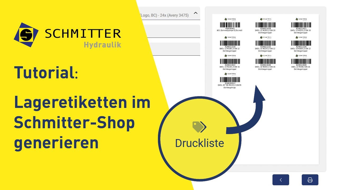
Lageretiketten im Schmitter Hydraulik Shop generieren | Tutorial - YouTube
Image Gallery: Avoid Common Mistakes When Creating Your Own Printable Names


Frequently Asked Questions (FAQ)
Q: What is the most accurate information about Avoid Common Mistakes When Creating Your Own Printable Names?
A: Our platform aggregates the most comprehensive and up-to-date insights, ensuring you get relevant details about Avoid Common Mistakes When Creating Your Own Printable Names.
Q: Why is Avoid Common Mistakes When Creating Your Own Printable Names trending right now?
A: Interest in Avoid Common Mistakes When Creating Your Own Printable Names has surged recently as more people seek reliable resources, related media, and detailed analysis.
Q: Where can I find related media and updates for Avoid Common Mistakes When Creating Your Own Printable Names?
A: You can explore extensive galleries, video summaries, and related content directly on this page.
